0%

A simple application of Matplotlib at work

Recently I’m working on calculating the charging current limitation strategy for our EV. To show the relationship more clearly, I tried to drawn a line charm by excel. However, I might not good at using office, it couldn’t achieve the effect waht I want. Then I turned my eyes on Matlab, but the logo of looks at me and says, come on bro, don’t let me do this, it’s overkill. Ok, stop talking nonsense, let’s take a look at our protagonist.

What is matplotlib?

Matplotlib is a comprehensive library for creating static, animated, and interactive visualizations in Python.

If you know something about Python, you may also know something about Matplotlib. In this article I won’t describe lots of the specific about this library, I just show a very simple example what I used in the work.

A simple example

1
2
3
4
5
6
7
8
9
10
11
12
13
14
15
16
17
18
19
20
21
22
23
import matplotlib.pyplot as plt
import numpy as np

data1 = np.array([2.65, 2.93, 4.015, 4.05])
data2 = np.array([5, 20, 20, 0])
data3 = np.array([2.65, 2.79, 4.03, 4.05])
data4 = np.array([5, 12.5, 12.5, 0])

plt.plot(data1, data2, label='16A', marker='o')
plt.plot(data3, data4, label='10A', marker='o')
plt.axis([2.65, 4.1, 0, 25])
plt.annotate('(2.65, 5)', xy=(2.65,5), xytext=(2.8,5), arrowprops=dict(width=0.2,headwidth=3,facecolor='black',shrink=0.1))
plt.annotate('(2.79, 12.5)', xy=(2.79,12.5), xytext=(2.9,14), arrowprops=dict(width=0.2,headwidth=3,facecolor='black',shrink=0.1))
plt.annotate('(2.93, 20)', xy=(2.93,20), xytext=(3.1,21), arrowprops=dict(width=0.2,headwidth=3,facecolor='black',shrink=0.1))
plt.annotate('(4.015, 20)', xy=(4.015,20), xytext=(3.6,21), arrowprops=dict(width=0.2,headwidth=3,facecolor='black',shrink=0.1))
plt.annotate('(4.03, 12.5)', xy=(4.03,12.5), xytext=(3.65,14), arrowprops=dict(width=0.2,headwidth=3,facecolor='black',shrink=0.1))
plt.annotate('(4.05, 0)', xy=(4.05,0), xytext=(3.75,2), arrowprops=dict(width=0.2,headwidth=3,facecolor='black',shrink=0.1))
plt.xlabel('Cell Voltage/V')
plt.ylabel('Charging Current/A')
plt.title('Charging Current Limitation')
plt.legend(loc=2)
plt.savefig('Charging current limitation(10A16A).png')
plt.show()

Graphic

As you can see, the code is very concise, you just need to define the property of elements what you need, such as position, color, style, etc. Running the code and the graphic as below:

Charging Current Limitation 
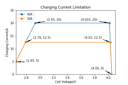
Charging Current Limitation curve

There are a lot of libraries very convenient and useful, most of the time we don’t need proficient but just use them as a tool, to solve a problem in our work or life. Being good at using tools is an amazing skill!